DataEngine Core
Executive numbers, finally readable.
We teach operators and analysts in Malaysia how to shape KPI dashboards that survive board scrutiny without drowning the room in charts.

Featured program
Executive Signal Lab
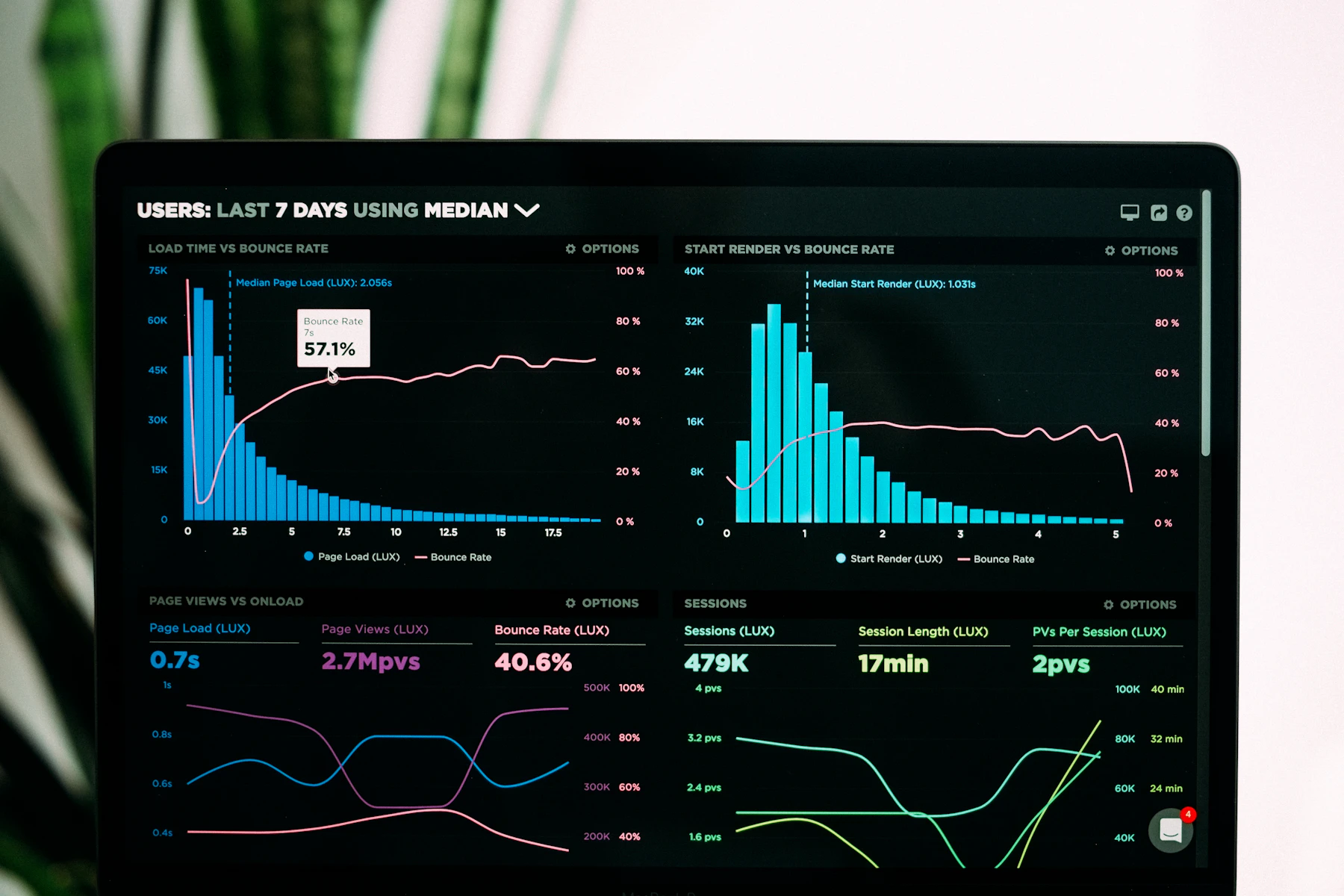
A hands-on path for building a Data Visualization and Analytics Platform for Executive KPI Dashboards — from metric selection to narrative layouts your leadership team can defend.
Explore the curriculumWhat changes after the work
Leaders stop collecting screenshots and start governing with a stable signal layer.
-
01
Metric contracts before visuals
Every KPI carries an owner, refresh window, and exception rule so the chart is never the argument.
-
02
Layouts that respect attention
We reduce chart clutter and sequence views the way an executive actually reads under time pressure.
-
03
Malaysia-aware operating rhythm
Reporting cadences account for multi-site operations, currency mix, and regional leadership habits.
-
04
Reusable studio assets
Templates, critique checklists, and annotation patterns travel with your team after the cohort ends.
Notes from people who shipped
Specific to modules and tools taught here — not generic praise.
The “exception strip” pattern from Module 3 cut our Monday pack from 19 slides to 7. Finance still pushes back on one lagging indicator, but the conversation is shorter.
I liked the KPI Studio critique more than the lectures. Our retail margin tile finally stopped looking green when returns were climbing.
Bring a real dashboard problem
Tell us which executive audience you serve and we will recommend a program path — informational pricing, no checkout.